
Published
Envisioning Data at Hubbard Brook
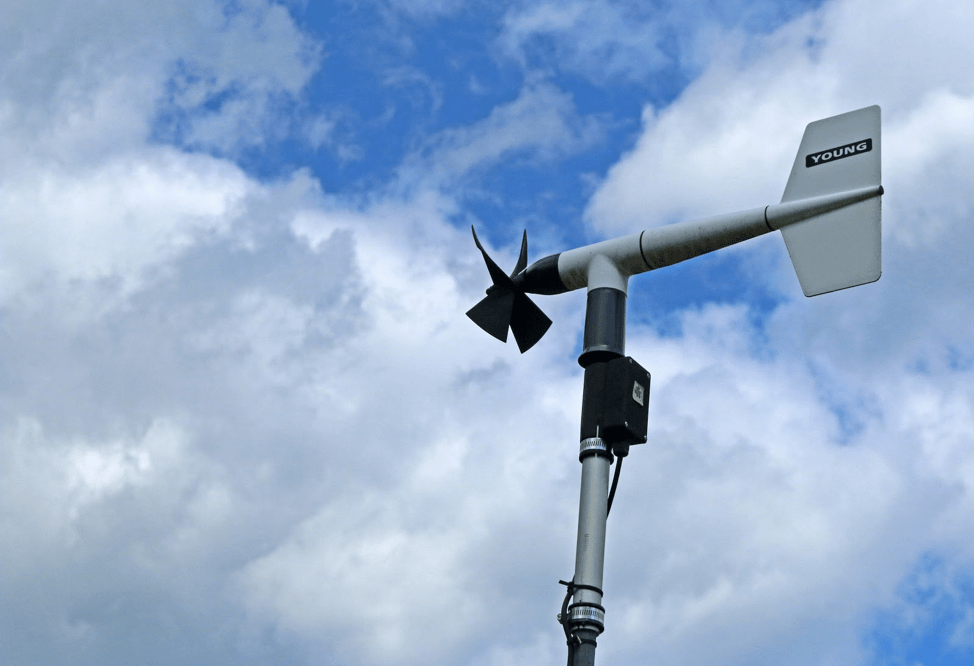
Hubbard Brook has multiple weather stations across its experimental forest.
Credit: E Zambello/LTER-NCO CC BY 4.0
It’s not every day that you walk into a forest and find musical instruments set up carefully next to a gurgling stream. Yet melding art and science together is a regular part of the day-to-day operations at the Hubbard Brook Experimental Forest.
Imagine the way that scientific data is normally presented—perhaps in a dense graph, table or figure in a scientific paper. Of course there’s nothing wrong with communicating data in this way, but it’s not the only method. That’s where art – and music in particular – come into play at the Hubbard Brook site.
The Waterviz at Hubbard Brook
Hubbard Brook’s Waterviz project uses multimedia art to share data through sight and sound. Live-streaming data power this animation. WaterViz accurately reflects water moving through the Hubbard Brook watershed, in near real-time. If evapotranspiration rates increase, so do the thread-like mist images rising from the virtual stream. Shiny green lights emanating from an animated tree showcase transpiration levels. Streamflow, snowpack, and more are all interpreted in one image.
When working with sound, musical instruments are attached to data sources and become louder and faster as the values increase. For example, the flute represents temperature. The higher the flute rises, the hotter the temperature at Hubbard Brook. Additionally, the flute rises and falls each day as the sun rises and falls, an auditory representation of the daily temperature cycle. By contrast, a guitar represents soil moisture. The more soil water present, the louder the guitar notes. Interested in snow levels? Listen for chimes.
Marty Quinn, musician and the owner of Design Rhythmics Sonification Research Lab, wrote the music, while Xavier Cortada designed the visualization of data seen on the Waterviz today.
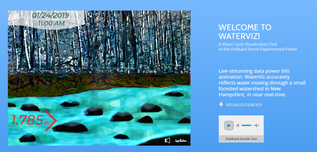
WaterViz artistically represents a live-stream of data from Hubbard Brook.
Credit: E Zambello/LTER-NCO CC BY 4.0
“We began to imagine the Waterviz in 2013,” explains Dr. Lindsey Rustad, Hubbard Brook team leader, “as we struggled with how to better understand and communicate increasingly large and complex ecological datasets among ourselves and to the public.”
Site scientists were interested in integrating science, art, and music to simultaneously engage the reasoning, visual, and auditory processing centers of people’s brains.
“The art has also been displayed for the public at art shows and scientific conferences,” says Rustad, “including the Miami New Media Festival, the Ecological Society of America and the Soil Science Society of America.”
A few weeks after my visit to Hubbard Brook, I slide into a desk chair and open my laptop back in my Florida home office, hundreds of miles from Hubbard Brook. Signing onto the Waterviz webpage, I watch the beautiful icons move across my screen, representing stream flow, evaporation, photosynthesis, and more. Moving to the audio section, I listened to the last four days of data from Hubbard Brook, then clicked back to 2014, then 2013. I can actually hear the difference in weather between the two years; can you? Despite my distance from the site, I could hear, see, and read about the conditions affecting a northern temperate forest and feel immersed in a virtual environment.
Sonifying Hubbard Brook
Torrin Hallett, a senior at Oberlin College and Conservatory in Ohio, worked for an entire summer sonifying data from Hubbard Brook.
“When there’s a confluence of art and science with the goal of representing, communicating, and disseminating data, it holds the potential to create more interesting and evocative presentation that can appeal to a larger subset of the general public,” Hallett writes in a blog for National Geographic Voices.
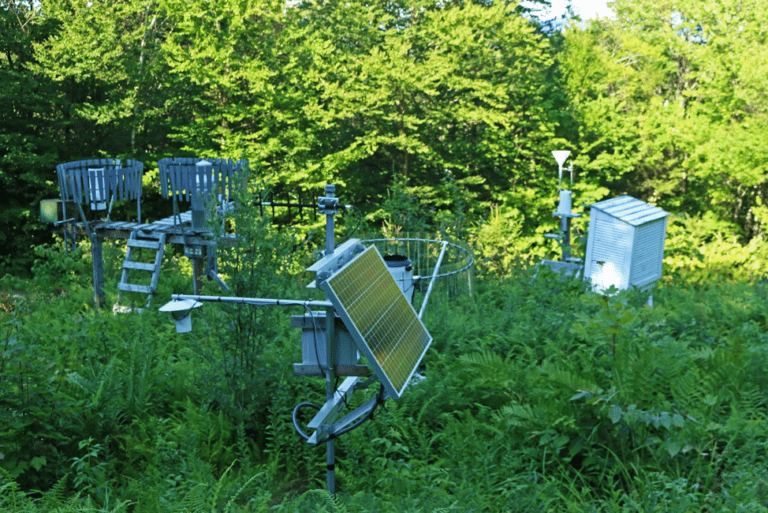
A forest weather station collects data used in Waterviz.
Credit: E Zambello/LTER-NCO CC BY 4.0
Hallett decided to work with the water cycle dataset from 2015, which includes 8,670 data points covering 10 separate variables collected from sites across Hubbard Brook. Using a computer program called Finale, he assigned different musical instruments to the 10 variables, just like Quinn did for the original Waterviz. “To represent streamflow, I created a tranquil clarinet melody,” he writes. “The streamflow rate controlled the clarinet’s volume. If the stream flowed fast enough, cymbals would also start playing, hitting more frequently with higher streamflow.”
In the end, he completed a 14.5 minute piece playing the entire year’s data.
Hallett hopes that his music, along with the Waterviz, will encourage members of the non-scientific community to spend more time interacting with the data.
In addition to planned classroom modules and online teaching resources, the WaterViz is freely open to the public. Students with special needs or with different learning styles can experience the changing seasons at Hubbard Brook, reducing the fear and intimidation sometimes associated with large datasets presented in traditional formats.
As someone who has been listening to the data through the years as an office-background soundtrack, I know that I have appreciated this approach! While I don’t necessary want to spend hours looking at spreadsheets and graphs chronicling a year at Hubbard Brook, I can easily slip on a pair of headphones and listen to a year of climate data, while watching the WaterViz change along the with the seasons.
Link to Original Article: https://lternet.edu/stories/lter-road-trip-music-and-art-meets-science-at-hubbard-brook/